Design system
The Planoda design system
The same OKLCH-anchored palette, density tokens, and motion language we ship in the product — laid out for press, partners, and anyone building alongside us. Logo, color, type, tokens, motion, and voice in one place.
The design system in short
- The product name is one word — “Planoda” — never abbreviated to “TT” in body copy.
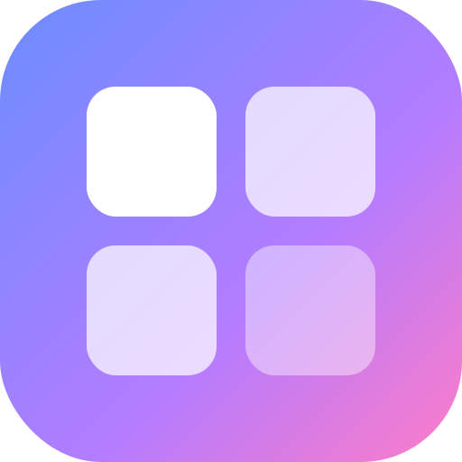
- The mark is a 2×2 tile glyph filled with the brand gradient (blue #6b8dff → purple #b47cff → pink #ff7cc7); it works on dark or light backgrounds with clear space around it and is never recolored, distorted, or placed on a busy photo.
- Color is token-driven: primary purple #b47cff, plus the --state-* (workflow status) and --priority-* families; status is always glyph-driven, never color-only.
- Type uses an Inter / Inter Tight ramp from 11.5px meta to 32px display; radii follow the --radius-* scale (field 8 · card 12 · panel 16 · pill).
- Logos, the full palette, and usage rules for press or partners: email press@planoda.com.
Logo
One mark, two registers.
The mark is a four-tile glyph — four tasks finding their place — filled with the brand gradient. It reads at favicon scale and at billboard scale. Give it room: at least one tile's height of clear space on every side.
PlanodaOn dark — gradient on ink
PlanodaOn light — gradient on paper
The glyph also ships as a flat gradient mark (/brand-mark.svg) and a single-color silhouette for OS badges and maskable PWA icons (/brand-mark-monochrome.svg).
Color
The palette.
Three brand hues anchor an OKLCH-tuned system. They live as named CSS variables — render bg-primary, not a copied hex — so the palette stays consistent across light, dark, and the accent themes.
Brand blue
#6b8dff
--task-blue
Gradient start · low-priority & todo accents
Brand purple
#b47cff
--primary
Primary · gradient mid · triage accents
Brand pink
#ff7cc7
--task-pink
Gradient end · pulse & highlight accents
Ink
#0e1016
--surface-0
Dark canvas base (surface-0)
Paper
#fbfbfd
--surface-1
Light canvas base (light surface-1)
--gradient-primary · 90° · blue → purple → pink
Tokens
Status & priority families.
Two product-critical token families. Status and priority each carry their own scale, and status never relies on color alone — the glyph shape encodes meaning (WCAG 1.4.1).
Workflow status · --state-*
- Triage--state-triage#b47cff
- Backlog--state-backlog#8b8fa3
- Todo--state-todo#6b8dff
- In progress--state-progress#f7c844
- Done--state-done#3fb950
- Canceled--state-canceled#8b8fa3
Priority · --priority-*
- Urgent--priority-urgent#ef4458
- High--priority-high#ff8a3d
- Medium--priority-medium#f7c844
- Low--priority-low#6b8dff
- None--priority-none#8b8fa3
Typography
The type scale.
Inter for UI and body, Inter Tight for display, and Geist Mono for identifiers and numbers (tabular-nums). The ramp is deliberately tight — eight steps from 11.5px meta to 32px display — so dense product surfaces stay calm.
Display--text-display32px
Hero--text-hero22px
Heading 1--text-h120px
Heading 2--text-h216px
Body large--text-body-lg14px
Body--text-body13px
Eyebrow--text-eyebrow12px
Meta--text-meta11.5px
Density
Radius & spacing tokens.
Layout chrome reads from CSS variables, not ad-hoc pixels. Radii are chosen by surface, and spacing tokens (--gutter, --card-pad-*, --chrome-pad-y) shift per density tier so the same component compacts cleanly.
Field
--radius-field
8px
Inputs, small controls
Card
--radius-card
12px
Feature / bento / pricing cards
Panel
--radius-panel
16px
Hero windows, big panels
Pill
--radius-pill
9999px
Badges, eyebrows, segments
Density tiers re-scale the spacing tokens — --gutter, --card-pad-x / --card-pad-y, and --chrome-pad-y — so compact, comfortable, and spacious layouts share one source of truth.
Motion
How things move.
Reveal, don't perform
Content reveals on scroll with a short staggered rise (the .mk-reveal-group cascade). The motion confirms arrival; it never blocks reading.
Spring & settle
Springs over linear easing. Transforms (translate / scale / opacity) only — never animate layout. Hover and focus states settle in under ~200ms.
Respect reduced motion
Every animation honors prefers-reduced-motion: the rise collapses to a clean fade, and the 3D canvas falls back to a static gradient mark.
Dimension
The 3D & canvas language.
The hero mark you see above is a live WebGL scene (OrbitLogo3D) — procedural IBL lighting on glass tiles. It's speed-gated: it only mounts on capable devices, and falls back to the flat gradient mark everywhere else, so the canvas never costs the page its load time.
Three-dimensional surfaces translate the flat brand gradient into light: glass tiles refract the same blue → purple → pink, lit by a procedural environment rather than baked textures.
Principles: speed-first gating (retina / high-tier only), graceful static fallback, and the gradient as the through-line between 2D chrome and 3D scenes.
Voice
How we sound.
Clear over clever
We write the way a sharp teammate talks — direct, specific, never corporate. Lead with the answer, then the why.
Honest by default
No fabricated metrics, no fake logos, no vapor. Build-in-public means the claims are real and the receipts are linked.
AI-first, human-in-control
Planoda is AI-native, not AI-bolted-on. The voice is optimistic about agents-as-teammates under transparent propose/approve governance.
Agents propose. Humans approve. Every action audited and costed.
The tagline. One word — “Planoda” — capital P, never abbreviated.
Usage
Do & don't.
Do
- Use the gradient mark on dark or light backgrounds, with clear space ≥ the height of one tile around it.
- Refer to the product as “Planoda” — one word, capital P.
- Keep status indicators glyph-driven (shape, not color alone) for WCAG 1.4.1.
- Reuse the real tokens — bg-primary, --state-*, --radius-* — never hard-coded hex.
Don't
- Don't recolor, rotate, or distort the logo, or add a drop shadow of your own.
- Don't place the mark on a busy photo or a low-contrast gradient.
- Don't abbreviate to “TT”, “Plan”, or any acronym in body copy.
- Don't invent token names or off-palette colors for product surfaces.
Assets
Download the marks.
The marks ship as inline SVG — infinitely scalable, recolor-free. For press kits, logo lockups, or partner co-branding beyond what's below, email press@planoda.com.

Press & partners